Digital Collaboration and the 21st C.
14.0K views | +6 today
Follow
Digital Collaboration and the 21st C.
Examines the connectivity possible for global knowledge participative creation and sharing.
Curated by Susan Myburgh
Your new post is loading...
Rescooped by Susan Myburgh from visual data
Scoop.it!

Is Data Visualization Art?

Is Data Visualization Art? | Digital Collaboration and the 21st C. | Scoop.it

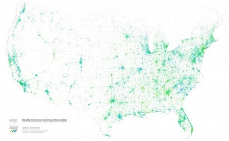
Data Visualization is driven by data. Its form is often derived from optimizing the efficiency of inputting data (and information about that data) into a human brain. It is a very pragmatic practice, built around numbers and logic.


And yet it is beautiful. It evokes emotions. It can be aesthetically pleasing, or hideous. It communicates complex concepts and provokes thought. It is consumed for enjoyment. Some visualizations even share similarities with poetry.

There are several stages in the life cycle of data visualizations, and while the core of the practice is driven by rational thinking, any number of stages in the process have opportunities for subjective decisions or artistic interpretations...


Via Lauren Moss
Lauren Moss's curator insight, January 24, 2013 7:42 PM

An overview of the creative and artistic processes involved in data visualization...

Rescooped by Susan Myburgh from Collaborationweb
Scoop.it!

The top 20 data visualisation tools

The top 20 data visualisation tools | Digital Collaboration and the 21st C. | Scoop.it

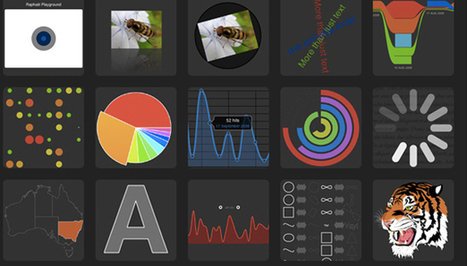
From simple charts to complex maps and infographics, Brian Suda's round-up of the best – and mostly free – tools has everything you need to bring your data to life...

A common question is how to get started with data visualisations. Beyond following blogs, you need to practice – and to practice, you need to understand the tools available. In this article, get introduced to 20 different tools for creating visualisations...


Via Lauren Moss, Baiba Svenca, Content, David Hain
Randy Rebman's curator insight, January 28, 2013 12:33 PM

This looks like it might be a good source for integrating infographics into the classroom.

Rescooped by Susan Myburgh from visual data
Scoop.it!

40 must-see vídeos about data visualization and infographics

40 must-see vídeos about data visualization and infographics | Digital Collaboration and the 21st C. | Scoop.it

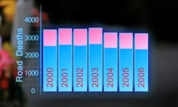
Visual Loop's selection of keynotes, TED Talks, and interviews by some of the top names in the field:


From Visualoop.com:

After the success of our collection of data visualization presentations a few weeks ago, we decided to push even further our research of multimedia resources and take the risk of selecting some videos. And we say risk, because the abundance of data visualization videos on the Internet is simply mind-blowing. Just think about it: How many events are there about information visualization? Dozens, maybe hundreds every year. Then, add the documentaries, interviews and educational videos, and soon you’ll realize, like we did, that this list could easily be up to one hundred or more. That means that a lot of good stuff was left behind, so apologies for that – but feel free to leave your recommendations in the comments section. Also, please note that some of these videos are over one hour long.
Via Lauren Moss
No comment yet.