To get content containing either thought or leadership enter:
To get content containing both thought and leadership enter:
To get content containing the expression thought leadership enter:
You can enter several keywords and you can refine them whenever you want. Our suggestion engine uses more signals but entering a few keywords here will rapidly give you great content to curate.

 Your new post is loading...

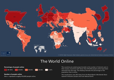


This is a really interesting visualisation of internet use from 2013. It relates really well to the IB Geography HL unit on Global Interactions.