


 Your new post is loading...

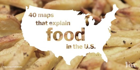

"The future of the nations will depend on the manner of how they feed themselves, wrote the French epicurean Jean Anthelme Brillat-Savarin in 1826. Almost 200 years later, how nations feed themselves has gotten a lot more complicated. That’s particularly true in the US, where food insecurity coexists with an obesity crisis, where fast food is everywhere and farmer’s markets are spreading, where foodies have never had more power and McDonald’s has never had more locations, and where the possibility of a barbecue-based civil war is always near. So here are 40 maps, charts, and graphs that show where our food comes from and how we eat it, with some drinking thrown in for good measure."
Via Skuuppilehdet


Nós somos aquilo que comemos ...
With more people than ever living in cities and less people than ever working on farms, the future of our food is in question. The riskiness, labor, low gain, and negative stereotypes of farmers combined with the fear of food conglomerates has led to a depletion of smaller scale farmers. Brain drain in rural farming areas is depleting the number of younger people willing to work in agriculture. With most of our food production being controlled and overseen by large corporations, people are now questioning the quality of our foods. Recently, the local food movement is educating people on the importance of food produced with integrity and supporting local businesses.
Occasionally these lists that say something like "40 maps that..." end up being an odd assortment of trivia that is interesting but not very instructive. Not so with this list that has carefully curated these maps and graphs in a sequential order that will enrich students' understanding of food production and consumption in the United States. Additionally, here are some maps and chart to understand agriculture and food in Canada.
Tags: agriculture, food production, food distribution, locavore, agribusiness, USA.