


 Your new post is loading...


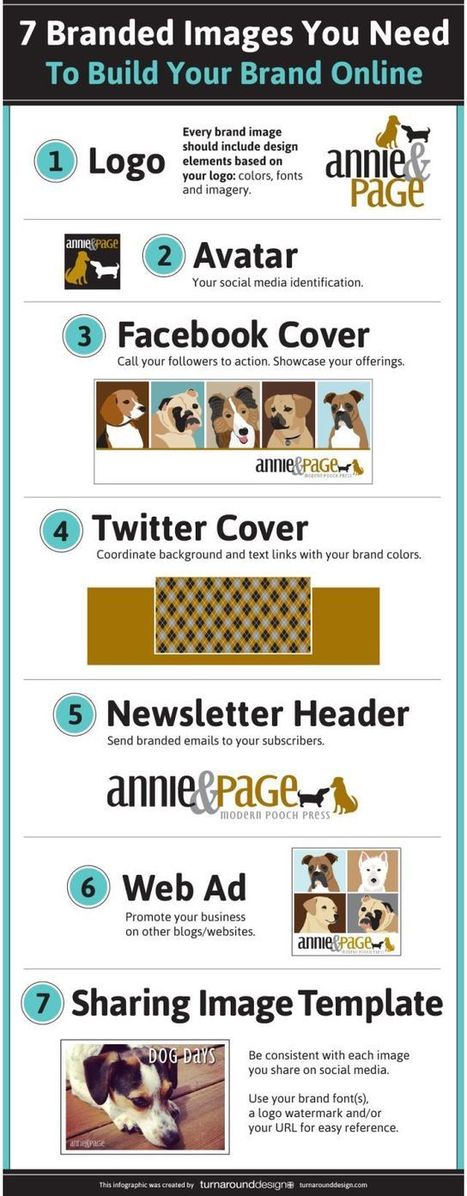
Do you want to make your infographics iconic? Okay, so we don’t mean “iconic” in the usual sense. We mean using icons in your infographic design. Icons are those little illustrative graphic images/clip art that represent an object, action or idea. They are often stylized and simplified designs. N
Using icons can make your infographic design more cohesive and more professional. With Venngage you can choose from over 10,000 icons in our icon library and stylize them to your preference by editing their colors, sizes and positions. Here are some tips for how to use icons in your infographics....


![Top 10 Design Trends For 2014 [Infographic] | World's Best Infographics | Scoop.it](https://img.scoop.it/mO5bvywlZP3EN-R7UPR29Tl72eJkfbmt4t8yenImKBVvK0kTmF0xjctABnaLJIm9)

![The Psychology of Colors [infographic] | World's Best Infographics | Scoop.it](https://img.scoop.it/b5FBcat_IhN9mYF6j8MrdTl72eJkfbmt4t8yenImKBVvK0kTmF0xjctABnaLJIm9)


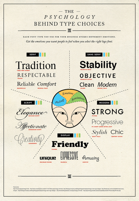


6 ways to use icons in your infographic design. Quick infographic tips from Venngage.