

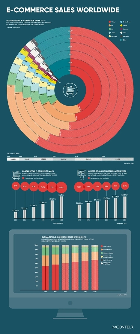
This infographic, published in The Future of E-Commerce Special Report, reveals the rise of global retail e-commerce sales worldwide. The graphic highlights China’s gigantic online shopping industry as well as worldwide sales by region
Get Started for FREE
Sign up with Facebook Sign up with X
I don't have a Facebook or a X account


 Your new post is loading...
 Your new post is loading...
Your new post is loading...
This infographic, published in The Future of E-Commerce Special Report, reveals the rise of global retail e-commerce sales worldwide. The graphic highlights China’s gigantic online shopping industry as well as worldwide sales by region


Jeff Domansky's curator insight,
July 21, 2017 2:46 AM
Excellent infographic!
Sign up to comment
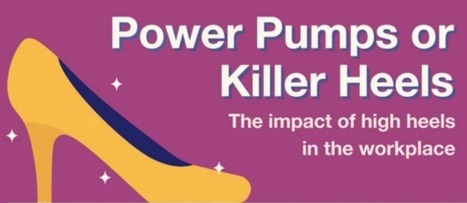
I work in an office where I can get away with wearing flip-flops most days, but many women aren’t so lucky.
Jeff Domansky's insight:
The painful truth about high heels and why some employers need to walk a mile in these high-heeled shoes.
Jeff Domansky's curator insight,
January 24, 2017 1:05 PM
The painful truth about high heels and why some employers need to walk a mile in these high-heeled shoes.
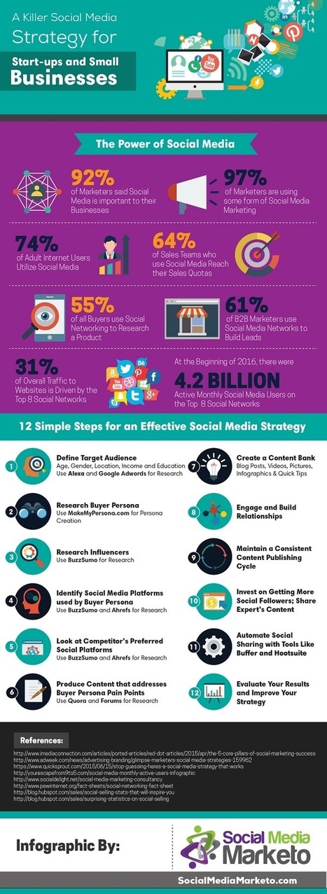
An infographic from Social Media Marketo outlines 12 crucial steps your business can take to set up for success.
Via malek, Jeff Domansky
Jeff Domansky's insight:
12 steps to more effective social media.
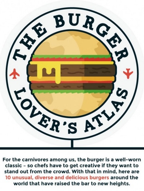
These tasty mouthfuls will stretch your idea of what can get go between two (or maybe three) buns. Would you like pickled lemon with that?
Jeff Domansky's insight:
Now that's a tasty infographic.

It’s not just a sausage in a bun; it’s a beautiful blank canvas. It’s a hot dog, which is a foodstuff eaten worldwide. Here are 40 distinctive varieties from around the globe — from iconic NYC “dirty water dogs” to fully loaded South American street-cart dogs to Japanese octo-dogs. There is a tubesteak out there for every craving that ever was.
Jeff Domansky's insight:
Hot dogs around the world. Who knew?
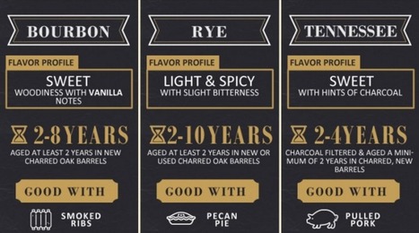
Drink up boys and girls. Today’s graphic will not only inform, but you’ll get to test your whiskey knowledge. How much do you know?
Jeff Domansky's insight:
This is one tasty infographic.
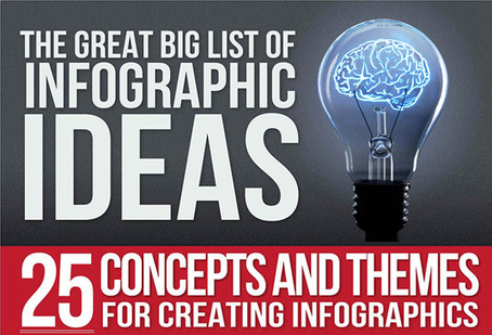
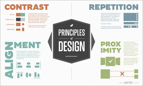
It's fair to say that 2015 has been an explosive year for infographics. Thanks to viral posts that explore everything from the risks of drinking diet coke, to quick funny hits exploring the creative process, the last twelve months have seen some amazing data visualizations.Unsuprisingly, some of the most beautiful and educational infographics in 2015 have been all about design, so we've collected 10 of the best below to round off your year and kickstart your creativity for 2016....
Jeff Domansky's insight:
Creative Bloq rounds up the biggest design infographics from the last year in this info-stuffed list.
Jeff Domansky's curator insight,
January 16, 2016 2:48 AM
Creative Bloq rounds up the biggest design infographics from the last year in this info-stuffed list.
When the worlds of content and data meet, infographics are born. That means 2015 was a pretty great year. At Visually, we don’t believe in wasting time, so we’ve pulled together all the best and brightest infographics in one place. To give the search for the best a little direction, we tried to select infographics that: - Use design to succinctly tell a story that images, data, or words couldn’t have conveyed on their ownInclude a narrative that keeps the viewer engaged (as opposed to a list of facts or data points) - Require little or no additional context to be understood - Create an emotional connection to the information that’s being shared. Mull over these fine specimens to get fired up for some awesome content creation in 2016. Or if you want to dig deeper, check out the complete list of our staff picks from the Visually Community. You know you want to!...
Jeff Domansky's insight:
Take a look at the best infographics of 2015! Creativity with your coffee!
Jeff Domansky's curator insight,
December 18, 2015 1:55 AM
Take a look at the best infographics of 2015! Creativity with your coffee!
Creating a really cool, memorable and–above all–shareable infographic comes down to investing the necessary time and attention in all the steps that lead up to an awesome data visualization.
The visual format you choose will depend on how you want to organize your information. To help you identify which type of infographic will best serve your purpose and audience, we’ve compiled a list of the most-used types, along with advice on when to use them and examples of each....
Jeff Domansky's insight:
Useful idea triggers for your next infographic project from Visme.
Jeff Domansky's curator insight,
November 23, 2015 9:37 PM
Useful idea triggers for your next infographic project from Visme. 
Juhana Peltomaa's curator insight,
November 24, 2015 6:11 AM
Tell your numbers as a part of your #BrandStory.
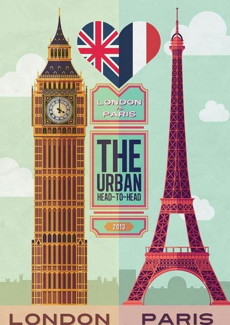
A 2013 study by Louis Alfieri published on Educational Psychologist suggested that case comparison activities commonly led to greater learning outcomes over other forms of case study including sequential, single case, and non-analogous, as well as traditional instruction. Today, we are going to learn how to take advantage of this concept and apply it to design an excellent educational infographic.Keep reading!...
Jeff Domansky's insight:
If you ever had to compare and contrast two things, sides or opinions, you've come to the right place. Learn to do it with an infographic!
Jeff Domansky's curator insight,
September 19, 2015 6:19 AM
If you ever had to compare and contrast two things, sides or opinions, you've come to the right place. Learn to do it with an infographic!

Google has many different sources of revenue, but one of their most noticeable is the ads that appear next to search results for specific keywords. How much that keyword costs depends, in part, on how often people search for it -- the more people search for a certain keyword, the more expensive it is. Via Brian Yanish - MarketingHits.com, massimo facchinetti, Lauren Moss
Jeff Domansky's insight:
Valuable data, great design!

Laura Tate's curator insight,
January 18, 2019 11:44 AM
Wow, San Antonio car wreck attorney is the most expensive keyword at more than $600
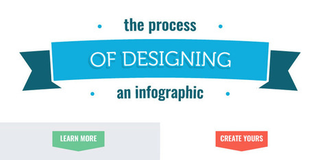
The mere thought of creating your own infographic can be scary and often is thought of as a complex task that can entail tens of hours.
Jeff Domansky's insight:
The 1-2-3's of creating infographics in - what else - an infographic from Visme.
Jeff Domansky's curator insight,
June 24, 2015 9:38 PM
The 1-2-3's of creating infographics in - what else - an infographic from Visme.
Creativity and great ideas can be dosed in a masterly way of aninfographic. Those 14 infographics is proof of that. They are tremendously useful information, it does so with full creativity and originality. Although most of them are about web design, some of those is also for SEO professionals or graphic designers themselves. I recommend you take a look at them because from the visual and composition view are very well developed....
Jeff Domansky's insight:
Great collection of Infographics for web design ideas.
Jeff Domansky's curator insight,
April 18, 2015 2:38 AM
Great collection of Infographics for web design ideas.
|
From
medium

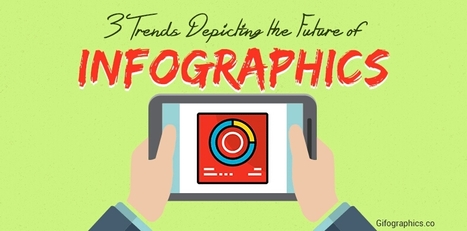
As a marketer, your content strategy is very important. Blogs, articles, social media posts, slide presentations, etc. There are so many ways to market your content. But in the last few years, infographics have caught the attention of online marketers and media professionals. They feature a combination of text, design, and images to convert complex data into an easy-to-read piece of content.With evolving visual communication, infographics are now focusing on driving flexibility, shareability, and audience engagement. The three trends that will help you in doing so are...
Jeff Domansky's insight:
Three infographics trends to follow.

DigitalVibes's curator insight,
October 27, 2017 2:54 PM
Las infografías llaman la atención en el sector del marketing porque combinan texto, diseño e imagen para convertir datos complejos en contenidos de fácil comprensión.
Las tres tendencias actuales en el mundo de la infografía son: 1- Diseño Modular: "crear secciones claras y exclusivas para varios tipos de datos. Esto permite ver las secciones como partes indiviuales de un contenido o como una parte de una infografía". 2- Storytelling: "transportar al usuario de una narrativa a otra, crear una experiencia para ellos y dejarles participar en ella". 3- Contenido Divisible: "crear una pieza central de contenido que puede fragmentarse en muchas". En este enlace se puede seguir leyendo el artículo propuesto y también se explica cada tendencia mediante una infografía: También lanzamos la siguiente pregunta: ¿Cómo pueden ayudar estas tres tendencias en e ámbito periodístico?
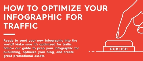
Just because you have an infographic designed does not mean it’s ready to go. There are a few more steps necessary to ensure success. You need to proofread. You need to publish. And, of course, you need to promote. Basically, you need to know how to optimize your infographic to get the most traffic. Unfortunately, we see many brands make rookie mistakes in all three of these areas. Whether it’s an unoptimized file name, broken share buttons, or pixelated images, these details can seriously hurt your infographic’s success. If you want to get the most eyes on your infographic, there’s more to do than you think. But don’t worry. Because our parent company Column Five likes to make things easier for you, they created this handy checklist to help you optimize your next infographic. They even put it in infographic form and checklist form. Feel free to print them out, bookmark them, or embed them on your site. Follow their tips and you’ll know your infographic is really ready to be published. On that note, you can also take a look at these deep dives into how to optimize your infographic for SEO and how to optimize your blogfor content distribution. Good luck out there!...
Jeff Domansky's insight:
Think your infographic is ready to go? Wait a sec. Here's the checklist you need to make sure you optimize your infographic correctly
Jeff Domansky's curator insight,
December 21, 2016 4:36 AM
Think your infographic is ready to go? Wait a sec. Here's the checklist you need to make sure you optimize your infographic correctly.

Real Money has done the math and shared their findings in the infographic Examining the Real Cost of Donald Trump's Wall, designed by DesignBySoap. It appears that the actual cost of the wall would end up being 2-3 times more expensive than the publicly released estimate. Luckily, even many of his supporters do not believe he will build the wall. You can see the details of Trump's plan, as well as some statistics on how Americans feel about it in the infographic above.
Jeff Domansky's insight:
Yep, we'll build that wall and I've got a bridge to sell you.
Jeff Domansky's curator insight,
August 26, 2016 10:19 AM
Yep, we'll build that wall and I've got a bridge to sell you.
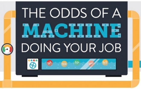
Spoiler Alert: The odds are high that a robot/algorithm is going to be better at your job than you are.
Jeff Domansky's insight:
This infographic is thought-provoking and an intriguing look at the impact of technology on the future of jobs.
Jeff Domansky's curator insight,
August 7, 2016 8:51 PM
This infographic is thought-provoking and an intriguing look at the impact of technology on the future of jobs.
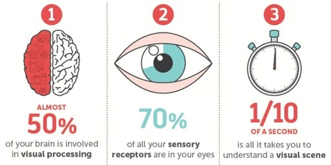
Think back to your first memory: Can you still see the watermelon pink dress you wore? Do you remember the unique checkered pattern of your father's jacket?
Jeff Domansky's insight:
Here's why our brains crave infographics... in an infographic.
Jeff Domansky's curator insight,
June 5, 2016 11:51 PM
Here's why our brains crave infographics... in an infographic.
We've trawled the web to find the most informative and inspiring infographics - just look what we've uncovered! Every picture tells a story, as they say, but sometimes it takes a clever combination of words and pictures to tell a story quickly, concisely and in an entertaining fashion. The best infographics may look like they were simple to create in Photoshop, but designing an effective piece of data visualization is usually anything but....
Jeff Domansky's insight:
Creative Bloq gathers 90 best Infographics. Awesome! Recommended viewing! 9/10

Gonzalo Moreno's curator insight,
January 19, 2016 11:01 AM
Many interesting ones, for many, many courses!
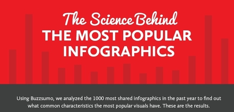
So why are some infographics destined to die in obscurity while others get passed along to every corner of the web? Content marketing researchers have been burning the midnight oil trying to figure out how to reliably produce viral content. After observing and analyzing a thousand different infographics across multiple industries and platforms, the team at SiegeMedia collected some interesting insights and patterns. As it turns out, going viral isn't entirely up to the hands of fate - the most popular content shared certain key characteristics. Take a look at the following visual and learn what makes an infographic popular...
Jeff Domansky's insight:
Useful tips for more effective Infographics.
Jeff Domansky's curator insight,
January 4, 2016 3:15 AM
Useful tips for more effective Infographics.
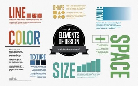
Being a visual designer can be challenging and invigorating at the same time. On the downside, you are expected to perpetually work at your creative peak, while also pleasing other people’s aesthetic preferences. On the positive side, you get to create fun and beautiful artwork for a living. To inspire you in your daily work as a graphic artist, we’ve compiled a list of insightful infographics with useful tips and design hacks. Valuable for both amateurs and professionals, these visual guides will surely become a part of your own personal collection of design manuals that can also be shared with your colleagues and friends....
Jeff Domansky's insight:
A list of insightful infographics with useful tips and design hacks for graphic designers and visual artists.
Do you want to make your infographics iconic? Okay, so we don’t mean “iconic” in the usual sense. We mean using icons in your infographic design. Icons are those little illustrative graphic images/clip art that represent an object, action or idea. They are often stylized and simplified designs. N Using icons can make your infographic design more cohesive and more professional. With Venngage you can choose from over 10,000 icons in our icon library and stylize them to your preference by editing their colors, sizes and positions. Here are some tips for how to use icons in your infographics....
Jeff Domansky's insight:
6 ways to use icons in your infographic design. Quick infographic tips from Venngage.
Jeff Domansky's curator insight,
October 21, 2015 10:50 AM
6 ways to use icons in your infographic design. Quick infographic tips from Venngage.
Infographics have become the design darling of visual marketing. It’s no wonder organizations and individuals are taking advantage of them as a communication tool. We’ve scoured the web to compile a collection of 45 inspiring infographics that show what’s possible in this design category. Browse through them to get some ideas for your next project....
Jeff Domansky's insight:
Take a look at how these infographics transformed tedious data into enlightening visuals — and learn some interesting trivia while you're at it!
Jeff Domansky's curator insight,
September 19, 2015 6:02 AM
Take a look at how these infographics transformed tedious data into enlightening visuals — and learn some interesting trivia while you're at it! 
Jasmin Davies-Hodge's curator insight,
September 21, 2015 4:13 AM
#infographics an excellent visual communication tool
While great infographics come in a variety of forms, the common thread is that they're visually pleasing and designed in a way that makes complex topics easy to understand whether you're a novice in the subject or an expert.
Jeff Domansky's insight:
Lots of infographics inspiration.

Claude Maran - Webmarketer's curator insight,
August 14, 2015 4:01 PM
ajouter votre perspicacité ... 
Elias "Estatistics" Tsolis's comment,
August 15, 2015 10:56 AM
the only one that i liked was this about plastic bugs
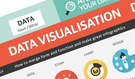
The following infographic, created by Zhenia Vasiliev, breaks down the basics of data visualization. It shows how beginners can merge form and function, and design meaningful infographics. Key highlights: - Analyse your data: Analysis is the key. Before we can visualize the data we need to understand it. - Come up with a story: Story is finding a single strand of meaning in an endless sea of information. It has a beginning, middle and end. - Make it visible: Visualization is a creative act of making. Making the data visually elegant evident and engaging. - Entertain to educate: Good data design need to illuminate and inform the viewer, elucidate and illustrate the facts and stats....
Jeff Domansky's insight:
Useful tips on how to turn data into compelling content.
Jeff Domansky's curator insight,
June 9, 2015 1:32 AM
Useful tips on how to turn data into compelling content. |


Excellent infographic!